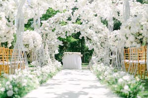
How to Use Dusty Blue in Your Wedding Décor (with Beautiful Ideas)
Dusty blue is what happens when blue decides to grow up, calm down, and become the most sophisticated version of itself, and the weddings that use it well have this quality of looking effortlessly elevated in a way that’s very hard to achieve with a more saturated color.
It sits in that specific territory between blue and grey that makes it work with virtually every metal, every neutral, every floral palette, and every venue from a rustic barn to a formal ballroom without requiring any convincing.
This guide will show you exactly how to use it in your décor, whether you want it as your dominant color story or as the most elegant accent running through everything else you’ve already planned.
How You Can Make Dusty Blue Work in Different Seasons
Spring (soft + fresh)
When it comes to spring, dusty blue feels light, romantic, and sort of effortlessly dreamy. It pairs perfectly with fresh florals and natural light. I personally prefer adding dusty blue into spring color palettes when it’s mixed with white, cream, or pale greenery.
It’ll give you the energy of garden weddings, breezy tents, flow-y dresses, and table settings that feel relaxed. It really helps a spring palette avoid being too pastel or “cutesy.”
Winter (cozy but elegant)
Winter dusty blue is chef kiss, if we’re being honest. It feels cool and collected without being icy. You can also add in deeper shades like navy or charcoal with some candlelight and velvet textures, and BAM. You’ve got luxe.
It also photographs super well in the winter against street lights, snow, or darker venues without getting lost like some lighter colors tend to do.
Summer (handle with caution)
Dusty blue can work for summer, I would just use it as an accent color tho. Too much bright sunlight on dusty blue can make it a little flat/gray. If you want to use dusty blue for a summer wedding, pair it with brighter shades of white, fresh greenery, or even a warmer neutral.
Fall (accent only, please)
Fall is honestly where dusty blue gets very picky. It can work, but you have to balance it with some warmer shades. All dusty blue next to burnt orange, burgundy, or dark brown makes me feel… unsure. I’d recommend using dusty blue as a pop in things like napkins, signage, or ribbons.
Dusty Blue Table Styling
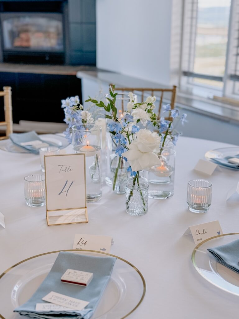
This table whispers, “Stay awhile,” and I am kinda here for it. The dusty blue napkins and soft white florals look effortless because they are. Nothing about this feels overdone. It’s perfect. The clear glassware, soft candlelight, and neutral stationery allow the dusty blue to speak for itself without overpowering the table.
If you love dusty blue but aren’t into heavy look, this is the perfect solution. It’s sophisticated, inviting, and quietly elegant.


Airy Dusty Blue Centerpieces With Soft Candlelight
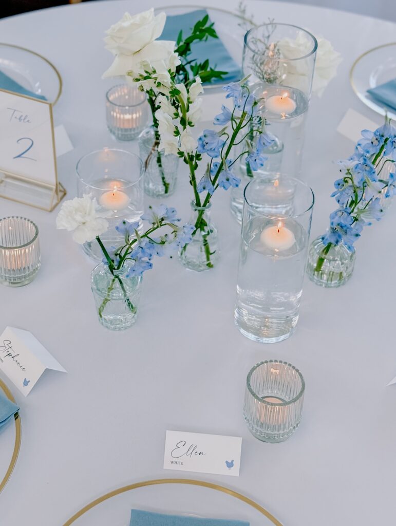
This table is like a big sigh of relief on a hectic wedding day. The dusty blue florals paired with white blooms keep the palette light and casual, and the glass vases add detail without overwhelming the eye.
It makes the table feel more lived in and casually elegant instead of perfectly arranged. If you’re looking for dusty blue to feel fresh and enduring, this is the kind of centerpiece that will let the color quietly shine, and guests will love the little details that we usually tend to overlook.

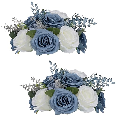
Dusty Blue Ceremony Backdrop With Soft Neutrals
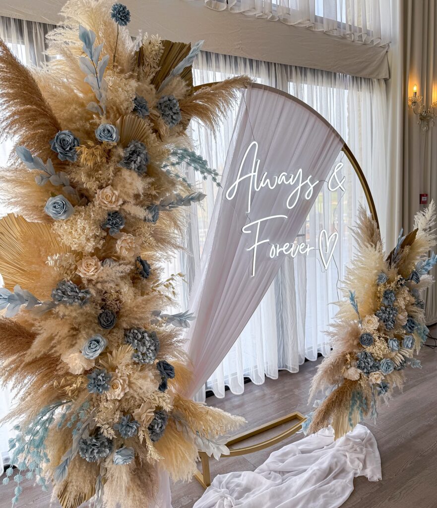
This is a backdrop that speaks for itself without screaming! With dusty blue florals hidden amongst warm neutrals, the look stays grounded and classic while pampas grass adds texture and softens the whole look. I hope you noticed by now that the dusty blue is just peeking through the whole look, not overpowering it.
If you want to take dusty blue to the next level and make it feel high-end and romantic, this backdrop will do all the work for you. And the photos? You know they will turn out amazing.

Dusty Blue Wedding Menu Styling
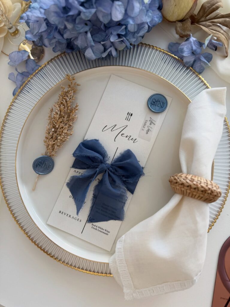
I love this menu setup because it feels so intentional. As soon as you walk into the space, your eye is drawn to the dusty blue ribbon. The menu feels more like part of the tablescape than a piece of paper that guests will read and push aside.
It’s a nice reminder that menus don’t need to be plain white cardstock, and with just a pop of color, you can have something your guests will notice and admire before that first plate is even served.

Dusty Blue Bridesmaid Dresses
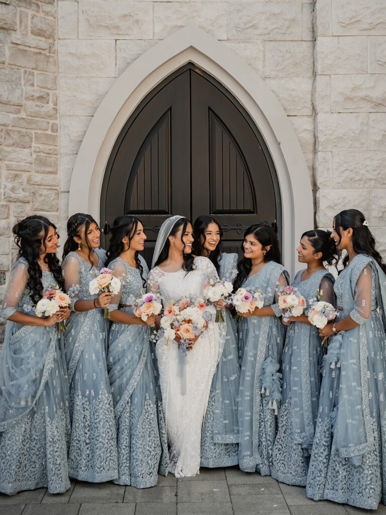
Dusty blue bridesmaid dresses are a great choice for a wedding dress color. I mean, look at how they photograph beautifully and flatter almost any skin tone. I personally like seeing them at spring and winter weddings when you want something softer and memorable.

Wedding Guest Book
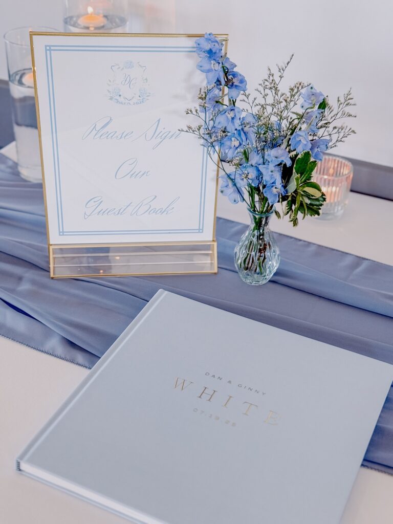
If you’re looking for an easy way to work dusty blue into your wedding, consider painting your guest book table like this. The soft dusty blue linen and matching guest book create a calm and welcoming vibe.
But you know what? It’s that addition of blue flowers that really sells the look to me. When I say it’s all in the litter details, I genuinely mean it.

Velvet Table Runners
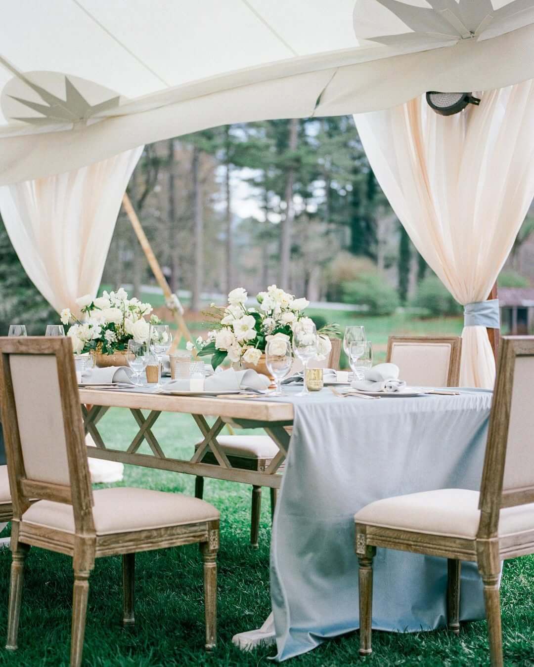
You can add texture to your reception tables with these dusty blue velvet table runners. They feel cozy but also very formal when placed on crisp white linens with metallic centerpieces. Again, a small detail if you ask me, but it does make a lot of difference.

Blue Tinted Mason Jars
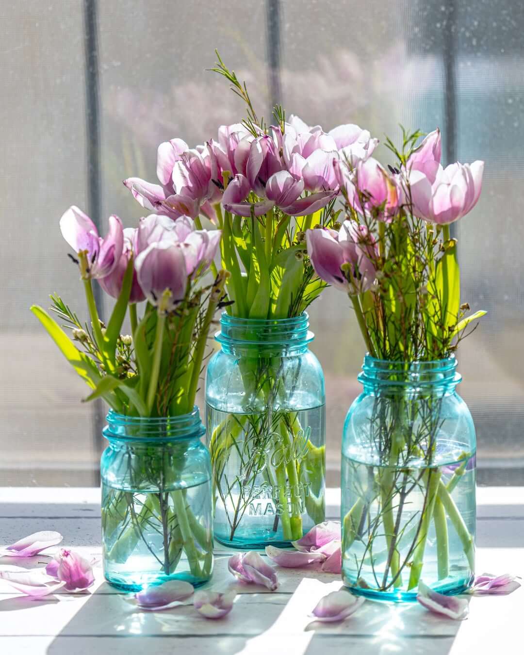
Blue-tinted mason jars work well when going for a romantic vintage feel, but also your pocket and your energy are limited. These are super duper simple additions to your wedding, and I am not hearing otherwise. Fill them with flowers or use them as candle holders for a subtle blue light on your tables at night.

Blue-Grey Table Linens
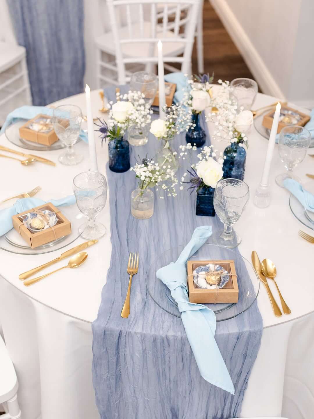
Blue-grey table linens create a beautiful, soft backdrop for your entire tablescape. It’s a single detail that will absolutely upgrade your tablescape game.
These linens are subtle enough to let other decor elements shine, yet they add a pop of color and are perfect for both indoor and outdoor receptions.

Dusty Blue Taper Candles
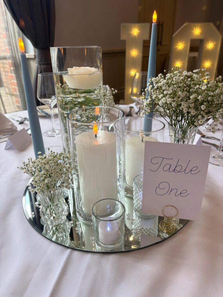
Dusty blue taper candles bring height and romance to your tables. It is such a cute addition to your wedding to bring the whole colour palette together without being too matchy-matchy.
They give off a lovely soft glow throughout dinner and are far more intriguing than boring white candles. Please mix heights for extra dimension, okay?

Slate Blue Napkins
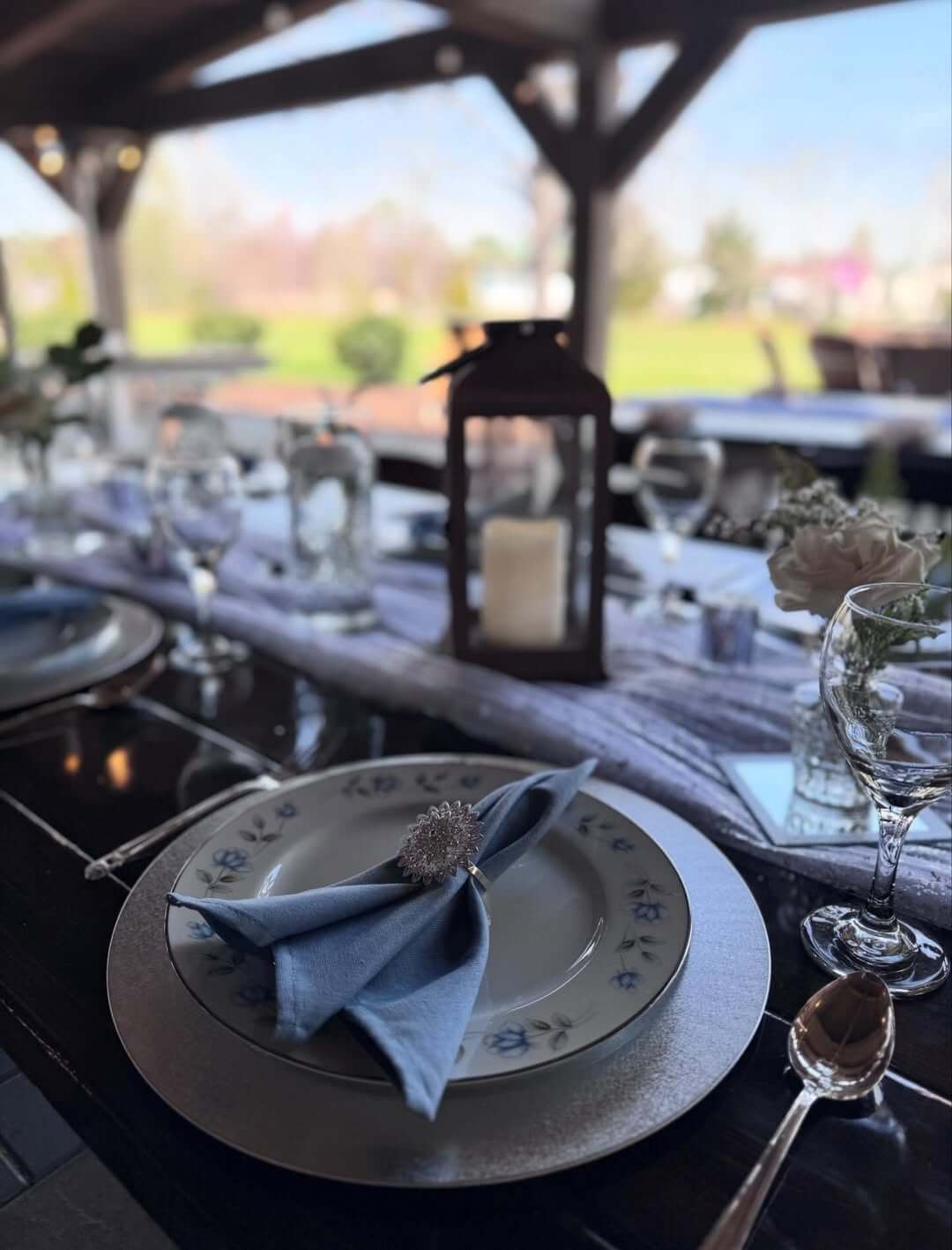
Slate blue napkins are my secret trick (shh, don’t tell anyone) for adding an instant dose of elegance to your table settings. They are also a lovely addition to make place settings pop when paired with metallic flatware. Add a lovely napkin ring to it, and you’re done!

Dusty Blue Wedding Cake
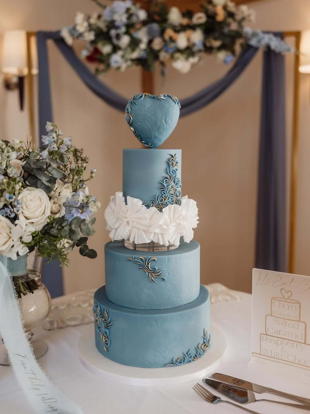
Wedding cakes don’t get much more show-stopping than dusty blue! If it does, let me know, okay? Go bold with all blue tiers or pair with white cake tiers for a softer, romantic option.
Dusty blue is one of my favorites because it isn’t as harsh as a bright blue and can work for any wedding season. You can bring in some white to soften the whole look as well.
Blue Agate Place Cards
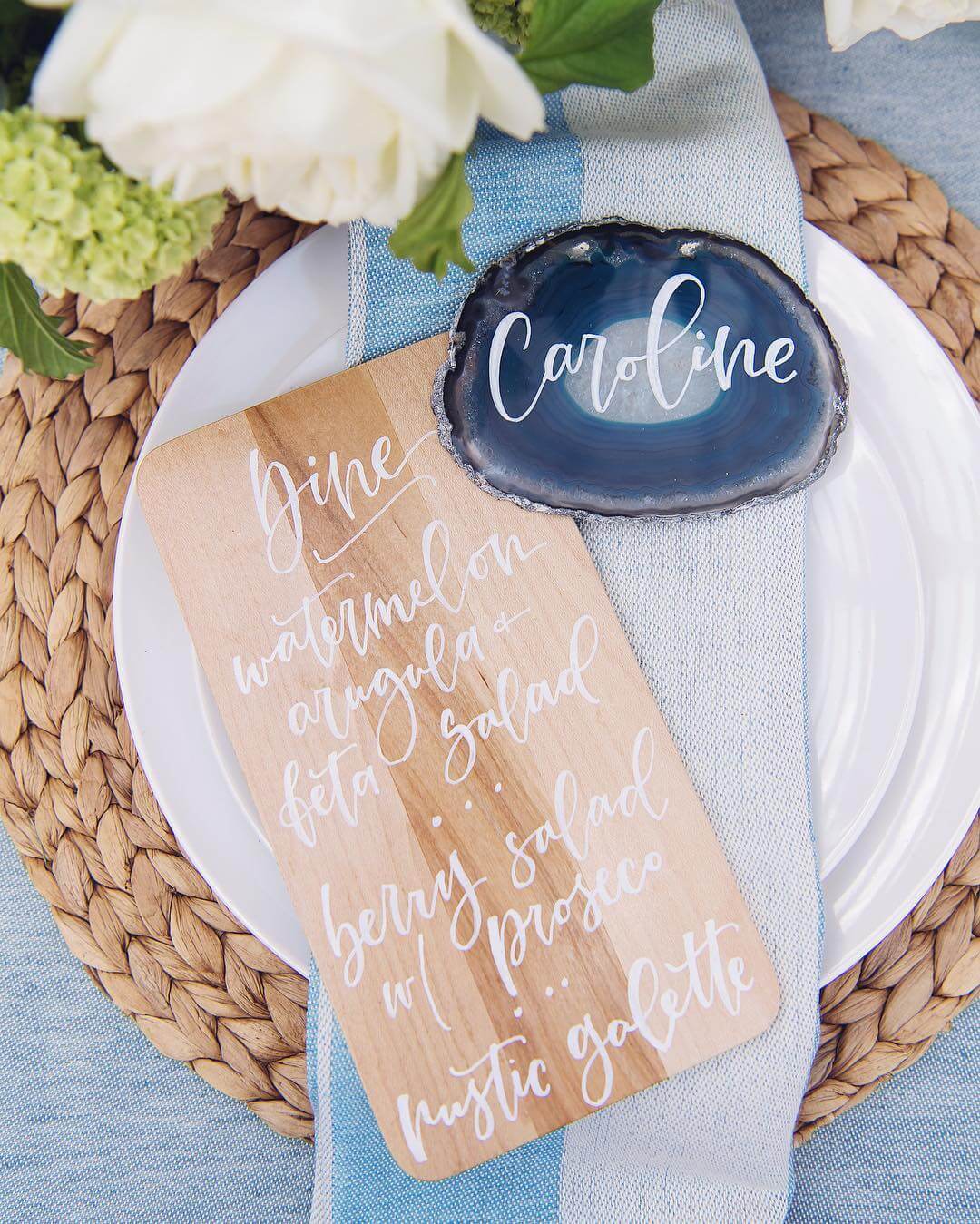
Blue agate place cards bring the outdoors to your table in a gorgeous way that you won’t be mad at all when you see it in person. Who knew slices of stone could be so fancy?! Your guests will want to keep these after they see their name beautifully written on that psychedelic blue stone.

Powder Blue Chair Sashes
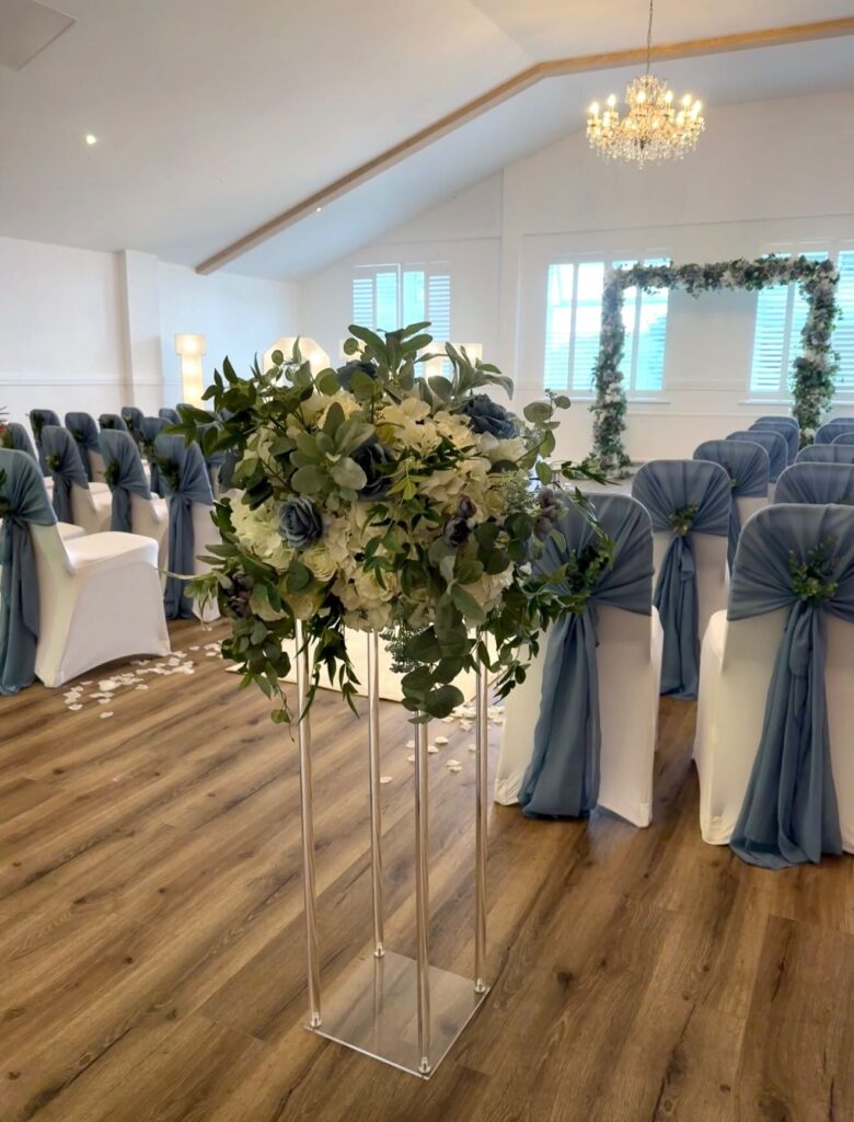
Powder blue chair sashes are an easy way to add a pop of color to plain venue chairs. I love how they flutter in the breeze during outdoor ceremonies and add just the right amount of color without being too much. Even for indoor ceremonies, this is such a great and underrated way to bring in the colour scheme into your big day.

Blue Delphinium Arrangements
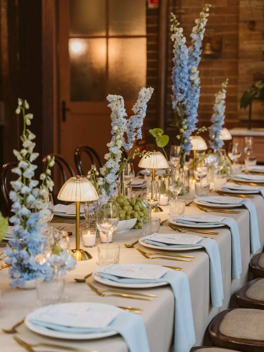
Blue delphinium arrangements are tall and dramatic with their spiky flowers. They’re like nature’s exclamation points ( I’m not kidding, just take a look at it for yourself). They make great statement pieces for ceremony backdrops or reception tables. Plus, they pair beautifully with other flowers such as roses or baby’s breath.
Dusty Blue Invitation
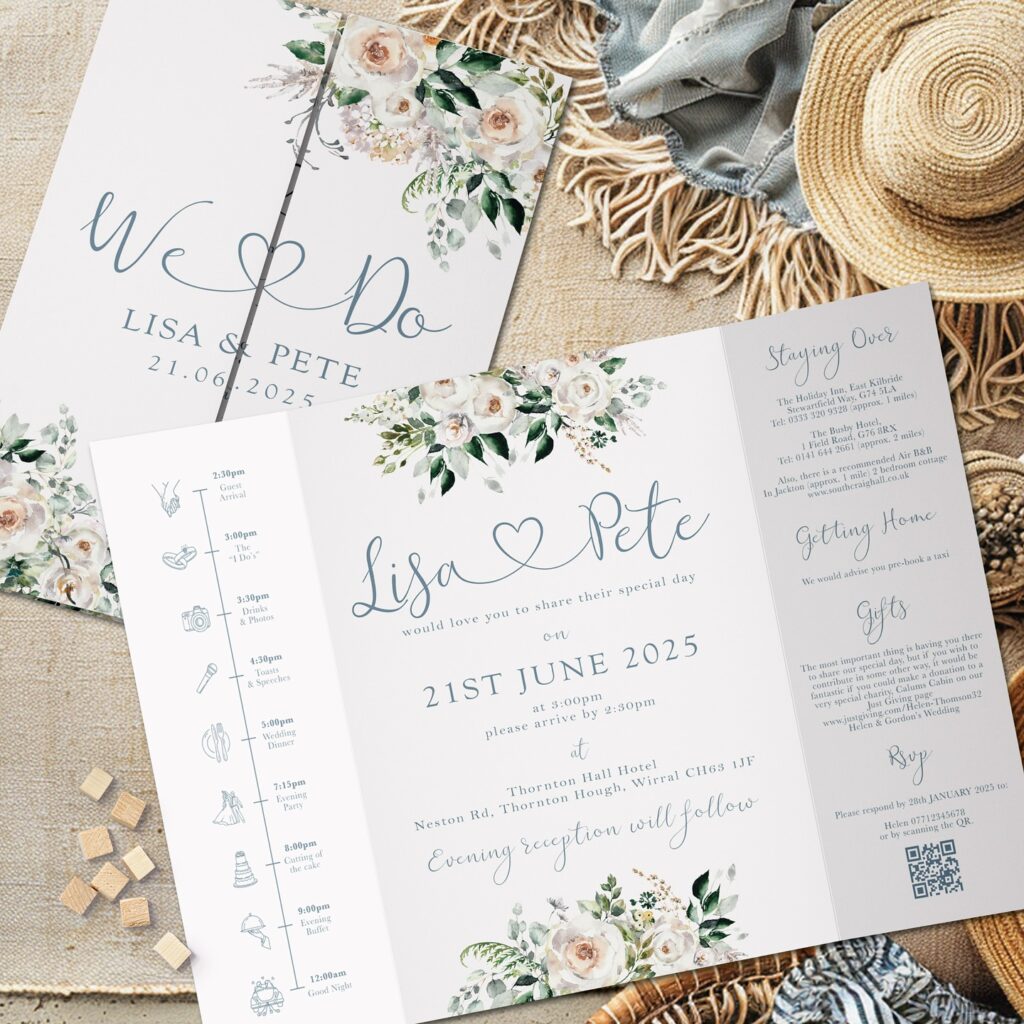
First Impressions are made with this invitation suite. It’s elegant but not intimidating. It’s inviting (bad pun, but you get me?)
If you’re looking for your guests to open their envelopes and feel calm and excited about celebrating with you, then consider reaching for invites that have this feel.

Blue Marbled Charger Plates
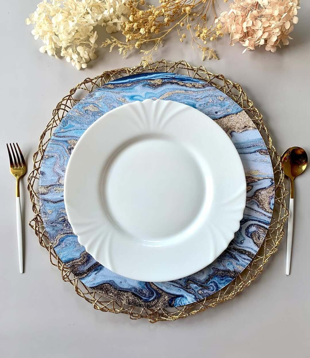
Blue marbled charger plates bring in a very chic look to your table settings. They’re like little pieces of abstract art placed under your dinner plates.
I have seen these work especially well at formal receptions where you want each place setting to feel special, and you know what else I’ve seen? Guests loving it. So, buckle up for this idea being a hit!

Dusty Blue Silk Ribbons
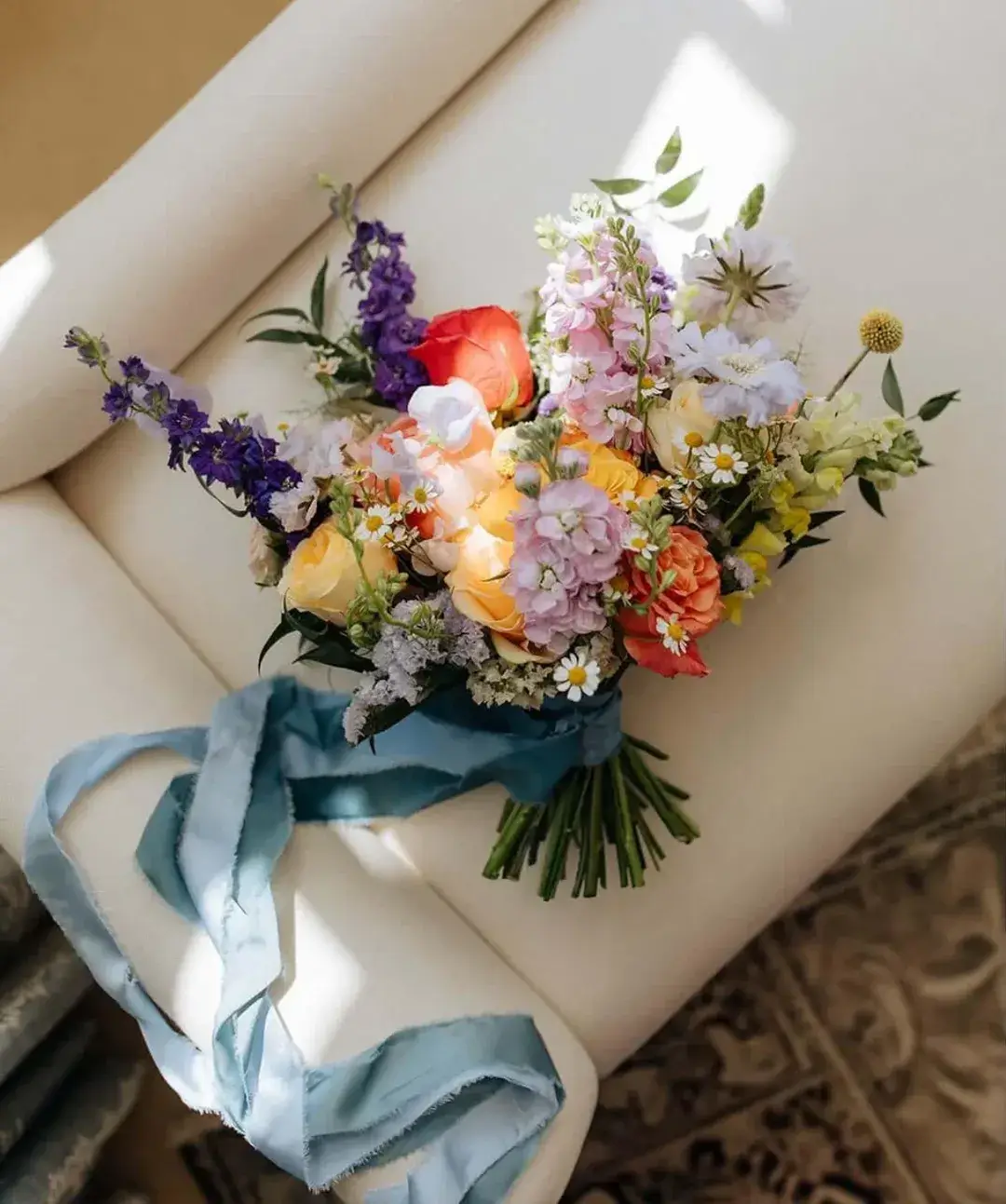
Dusty blue silk ribbons are extremely versatile. Use them to tie bouquets together or wrap them around chairs or to drape down from centerpieces, or you can even hang them as cute bows across your backdrop. They’re also great if you want to add subtle pops of color around your venue. Do I need to convince you any further?

Blue-Tinted Glass Votives
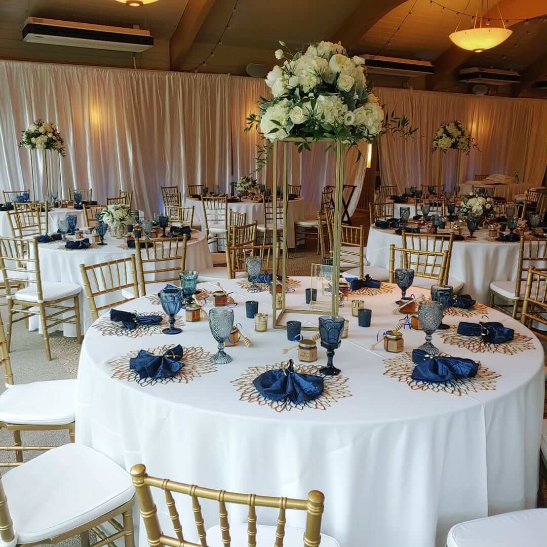
Blue-tinted glass votives cast a beautiful, soft glow on your tables during dinner time. They create a cozy, flattering light that will make everyone look great in photos and can be used in any season, from summer garden parties to winter wonderland themes.

Dusty Blue Ring Box
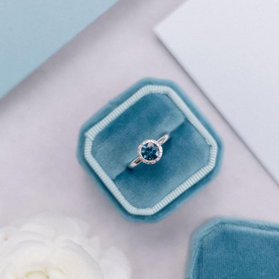
A dusty blue ring box is one of those small details that makes a big difference in your wedding photos. The velvety blue backdrop will make those close-up shots of your rings pop. Like I always say, it’s the small details that tie the whole thing together, and I promise, it won’t go unnoticed.

Blue Hydrangea Centerpieces
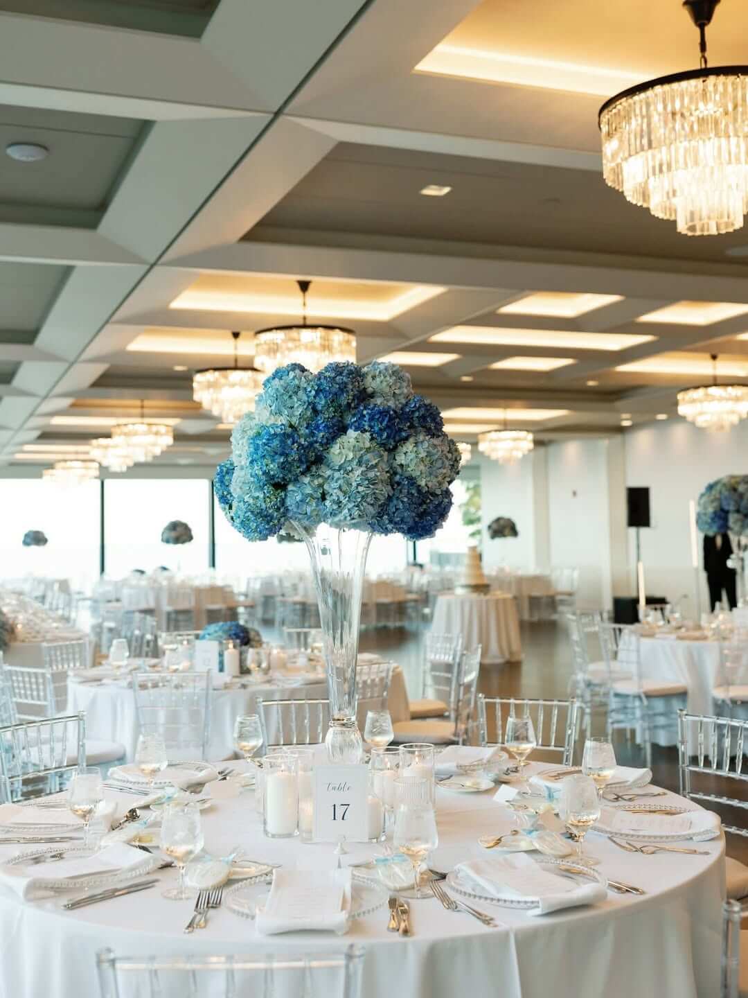
Blue hydrangea centerpieces are showstoppers that naturally come in the perfect shade of dusty blue and fill out table arrangements beautifully.
They are my go-to choice for bouquets when you want drama without breaking the bank on harder-to-source blooms. There are also such amazing choices for your centerpieces or just about any decor at your wedding.
Dusty Blue Table Numbers
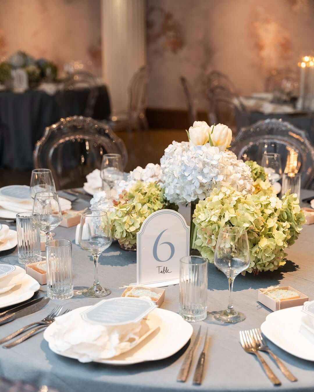
You can add a super subtle touch to your reception tables with these elegant dusty blue table numbers. I love how these muted blue numbers look, especially striking on clear acrylic or white cardstock. They help guests find their seats while keeping your color scheme flowing, and also while being super cute.

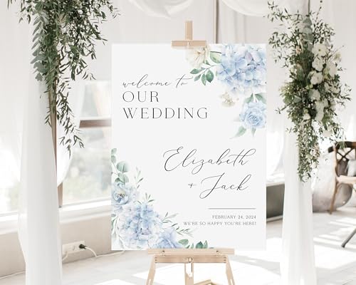
Dusty Blue Welcome Sign
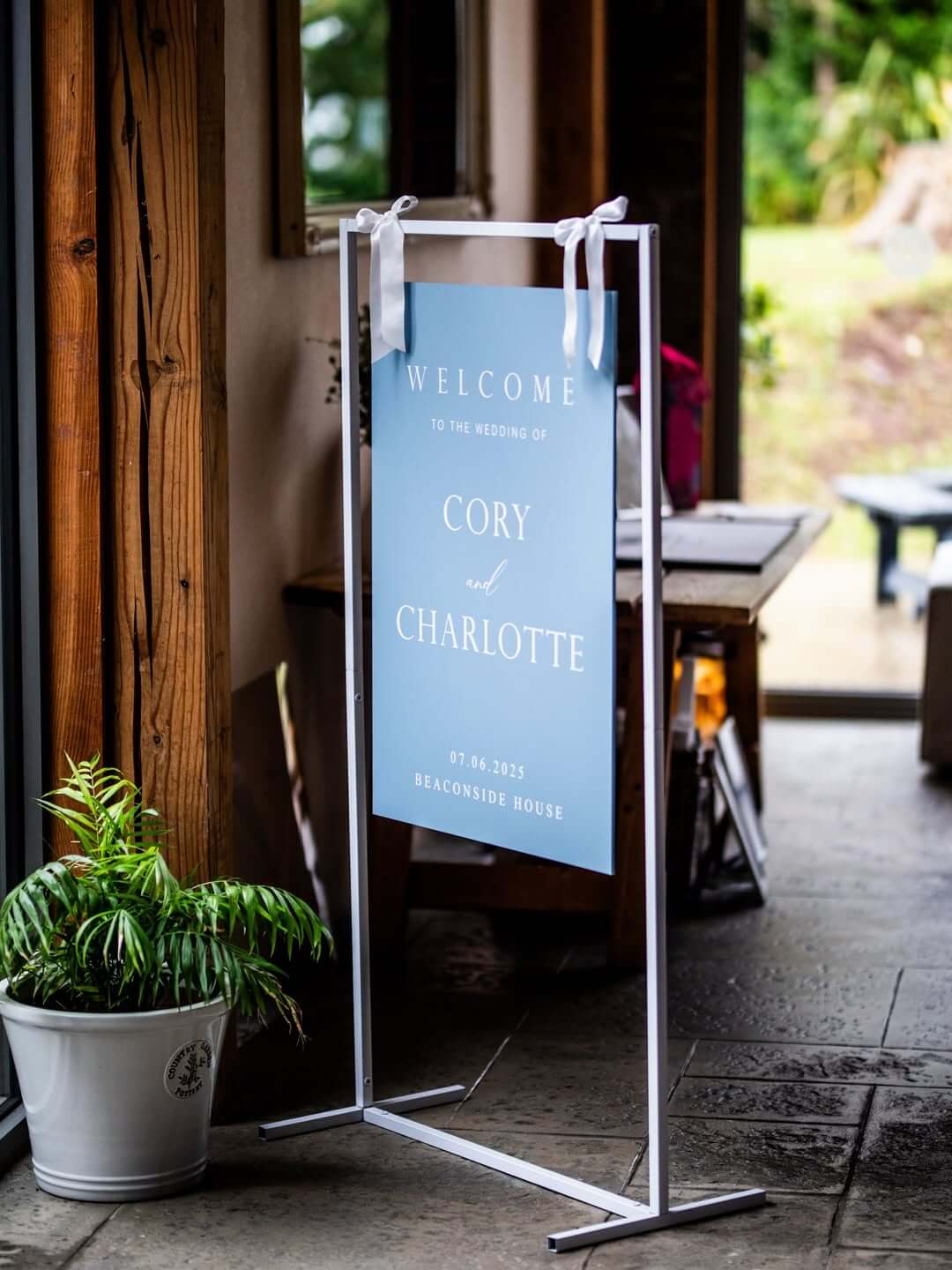
What better way to welcome your guests than with a sign that greets them in dusty blue? Whether you choose a simple wooden board painted in this gentle shade or opt for metallic lettering on a dusty blue background, it will make everyone feel special upon arrival. This idea is great for both outdoor garden parties and elegant ballroom receptions.
Colors Dusty Blue Goes With (Always)
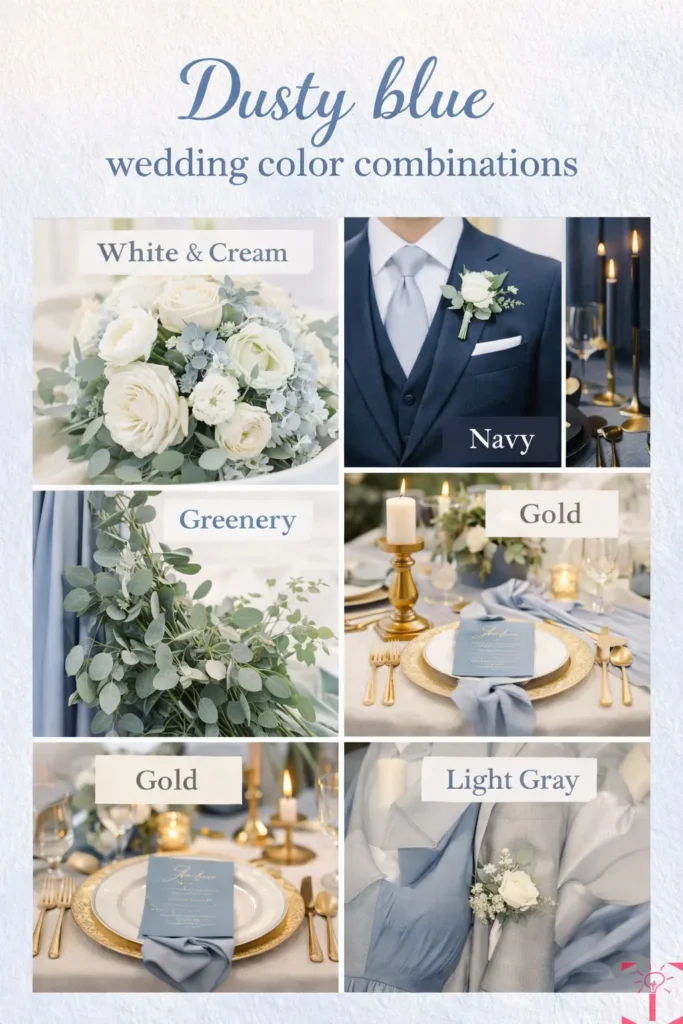
Safe choices. Trust me, you can’t go wrong with these.
- White + Cream
Clean. Classic. Soft. White and creams allow dusty blue to feel light and romantic instead of heavy. Go for it with tables, florals, and stationery.
- Greenery
Eucalyptus. Olive. Ruscus. You name it. Dusty blue and green are best friends. Greens keep the palette feeling fresh and natural, and work for literally every season.
- Navy
Think of dusty blue’s big sister. Navy grounds it and provides contrast without being heavy. Love this combo for more formal or evening weddings.
- Soft Gold / Champagne
Warm metals make dusty blue feel luxurious instead of chilly. Champagne gold is my favorite if you want glam but not over-the-top.
- Light Gray
Gray keeps dusty blue feeling current and crisp. Stick to light grays so your palette doesn’t get muted or end up looking super dull.
Colors Dusty Blue Goes With (Cautiously)
Not necessarily, no, just use with caution.
| Color / Element | Why It Doesn’t Work with Dusty Blue | Better Alternative |
|---|---|---|
| Bright White + Harsh Lighting | Super bright white lighting can make dusty blue look washed out and faded. | Use softer whites, warm lighting, or candlelight for a balanced and elegant look. |
| Icy Silver | Silver can remove the warmth from dusty blue, making the palette feel cold and overly sharp. | Pair silver with warm textures like raw linen, wood, stained finishes, or candles. |
| Bold Yellow or Orange | Strong yellow and orange tones clash heavily with dusty blue and can feel visually chaotic. | Choose muted warm tones instead, like champagne, peach, or terracotta accents. |
| Deep Earth Tones (used incorrectly) | Dark brown, mustard, and rust can look heavy or cheesy when dusty blue is the dominant color. | If using earth tones, let them lead the palette and use dusty blue only as an accent color. |
Popular Dusty Blue Mistakes You Must Avoid
| Design Mistake | Why It Doesn’t Work | Better Approach |
|---|---|---|
| Oversaturation | Too much dusty blue can make a space feel dull, gray, and visually flat. | Use dusty blue as an accent color rather than the dominant shade in the room. |
| Pairing Dusty Blue with Icy Silver | Since both are cool tones, the combination can make the room feel cold and uninviting. | Choose warmer metallics like champagne gold or brushed brass for balance. |
| Accenting Every Nook and Cranny | Overusing dusty blue everywhere makes the room feel crowded and overwhelming. | Limit dusty blue to 2–3 focal areas and keep the rest of the palette neutral. |
| Harsh or Cool-Toned Lighting | Cool lighting strips dusty blue of its softness and richness. | Use warm-toned bulbs, soft ambient lighting, or candles to enhance the color. |
| Texture-Less Room | Flat fabrics and smooth surfaces can make dusty blue feel lifeless and one-dimensional. | Layer textures like velvet, silk, linen, wood, or glass for depth and warmth. |
Dusty blue is the rare wedding color that looks intentional and considered regardless of how much or how little of it you use, which makes it one of the most forgiving and versatile choices available to anyone planning a celebration right now.
Whether you commit to it fully across your florals, linens, and stationery or use it as a quiet accent that ties everything else together, it delivers the same quality of quiet sophistication that makes wedding photographs look like they belong in an editorial.
Take the ideas that fit your vision, adapt them to your venue and your palette, and trust that dusty blue will do exactly what it has always done, which is make everything around it look more beautiful and more considered than it did before.