25 Wedding Decor Diy Ideas
The mason jar sat on my kitchen counter for three weeks before I did anything with it. Then came the twine. Then the eucalyptus, the flickering tea light, the hand-lettered table number tucked into a slot I’d cut with a craft knife at midnight. That single centerpiece cost me under four dollars, and it kicked off a full-blown wedding decor obsession that saved us thousands. Below, you’ll find 25 DIY projects I actually tested, tweaked, and (in a few cases) completely botched before getting right—everything from paper flower backdrops and dip-dyed table runners to a chandelier made of embroidery hoops. Some take an afternoon. Others, a weekend. All of them look far more expensive than they are.
Polaroid Photo Display Frame
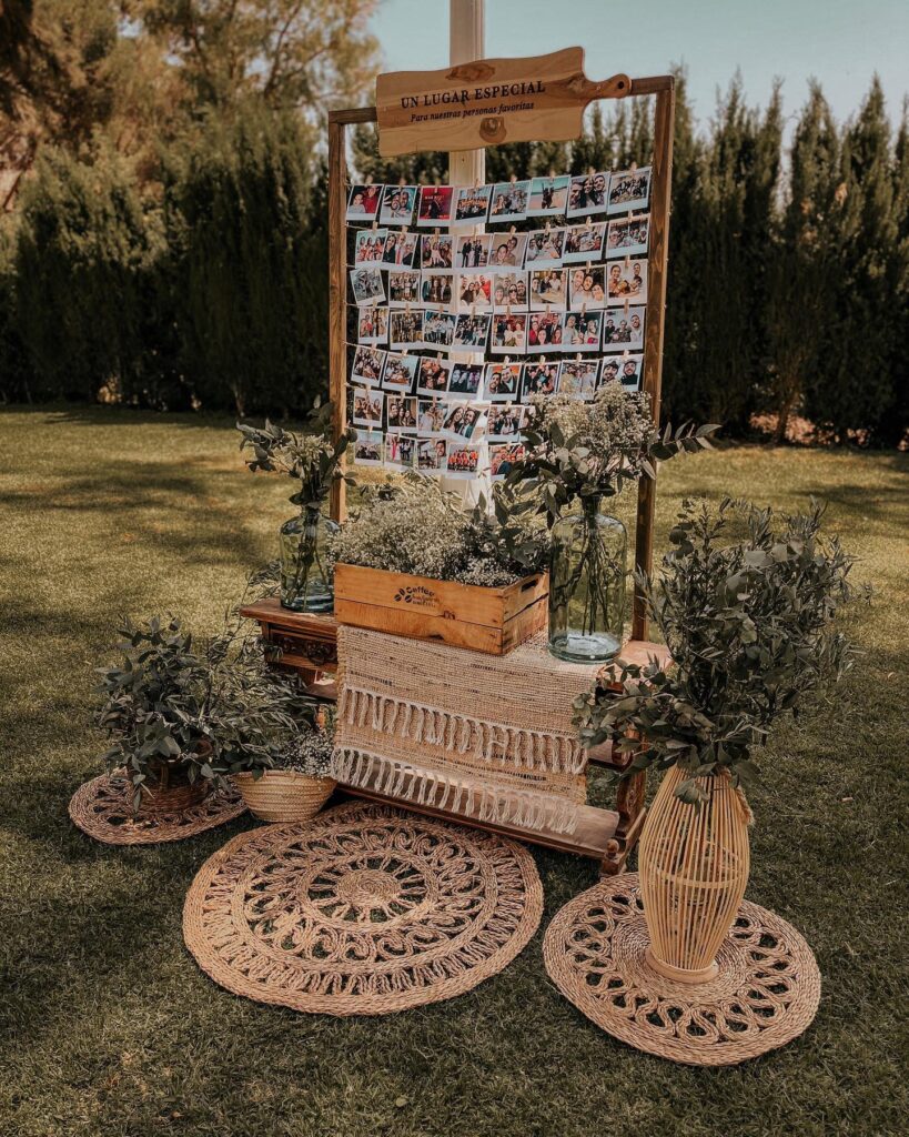
String the photos across horizontal lines of twine using small wooden clips — four or five rows fills the frame without looking sparse. The wooden crate sitting on the pallet shelf below actually pulls double duty here, holding baby’s breath upright while giving the whole thing a base so it doesn’t just float in the grass. You can rent a frame like this or build one from untreated lumber for under $30.
Skip the jute placemats on the ground if your venue has uneven grass — they shift around and someone will trip. What really makes this work is volume; you need at least 50 photos or the board looks half-finished.
Hoop Seating Chart
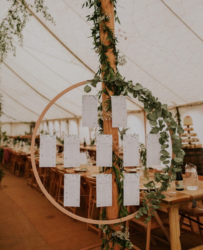
A wooden hoop does most of the work here, especially when it is tied to a tent pole or a standing frame instead of being balanced on a table. Use thin wire or fishing line to hang the seating cards in rows, then cover the knots with eucalyptus stems and a few tiny white flowers. Keep the cards plain.
If the guest list is large, print by table rather than alphabetically, because small hanging cards can turn into a little search mission. I would also test the weight before the wedding day, since fresh greenery gets heavier than it looks.
Open Book Backdrop Wall
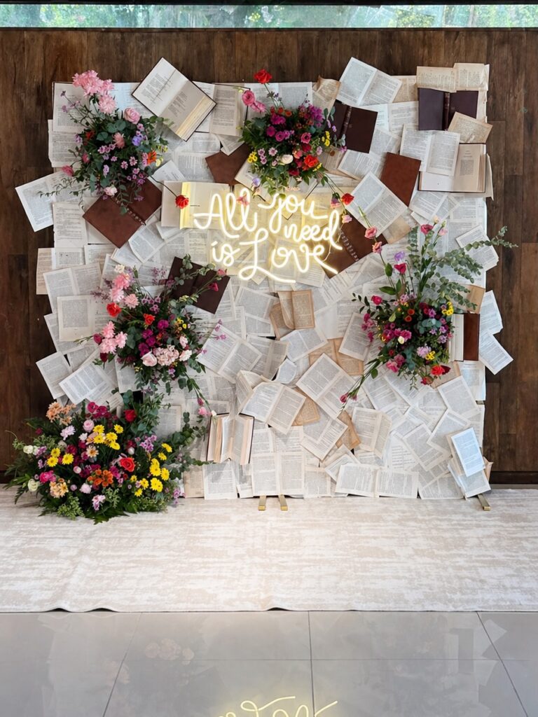
Rip apart old paperbacks. That’s the whole starting point. You want the kind of hardcovers and softbacks nobody wants at the thrift store — the ones going for a dollar a stack — because you’ll be splaying them open, some face-down, some fanned, pinned flat against a plywood board covered in muslin.
The leather-bound ones matter. They break up all that yellowed paper and give your eye somewhere to rest, otherwise the whole thing reads as visual noise. Tuck floral clusters into the gaps at uneven heights, and let one big arrangement pool on the floor so the wall doesn’t feel like it’s floating.
The neon sign is doing heavy lifting here — if that’s not in your budget, a single warm bulb behind cut-out letters gets you close enough.
Pallet wedding timeline
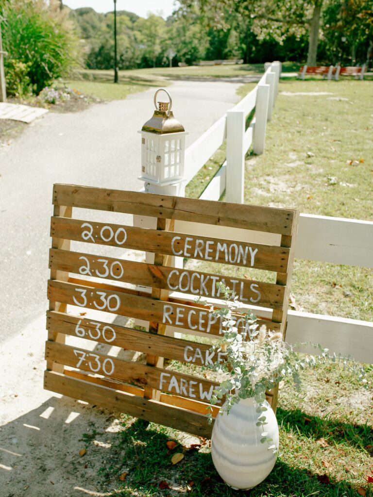
Start with a wooden pallet and paint the schedule straight onto the slats so guests can read it while they’re still walking in. The times on the left and the event names on the right keep it clear, and that split layout matters more than fancy lettering once people are standing a few feet away in bright sun.
Use thick white paint or a paint pen. Small script looks nice up close and useless from the path.
Leaning it against a fence works because you don’t need an easel, and the white lantern on the post helps mark the spot without adding another full sign. Add one large floor vase with loose greenery at the base and stop there. Too many flowers would make it fussier than it needs to be. If I changed one thing, I’d darken the lettering a bit more for late-afternoon shadows.
Wine Bottle Seating Chart Ladder
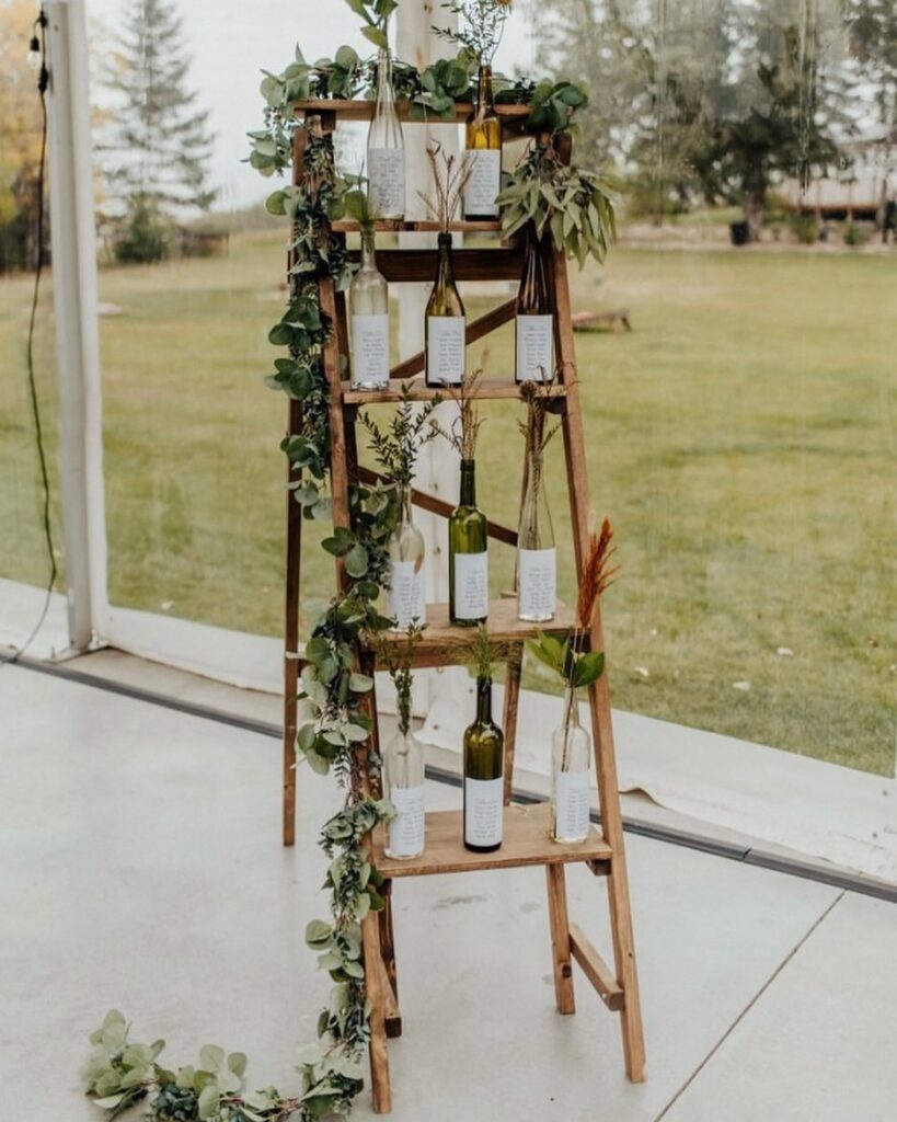
Collect bottles in the months before — different shapes and tints work fine together, as you can see from the mix of clear and dark green ones on each shelf here. Print guest names and table numbers on small white labels, attach them to the bottles, then tuck a sprig of dried grass or eucalyptus into each one. The ladder itself does most of the work as a display structure.
A wooden A-frame ladder from a thrift store or Facebook Marketplace usually runs under $30. Drape a eucalyptus garland loosely down one side the way this one has it, and let a bit trail onto the floor — that part actually matters for the overall look. Suits outdoor or barn venues especially well.
Framed Table Numbers
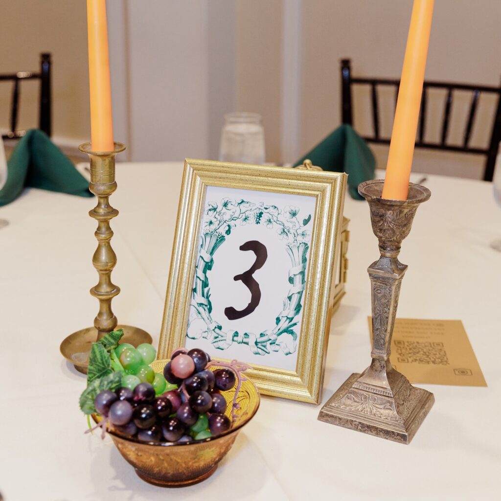
A gold frame does most of the work here, especially if the table number is printed with a leafy border instead of plain black text. Keep it upright. Look for small frames at thrift stores and use brass candlesticks that do not match, because matching them all can get expensive very fast.
The orange tapers make the table feel less like a rented hall, which is useful when the linens are basic and the chairs are doing nothing special. I would skip real grapes unless the table is being cleared often; faux ones in a small bowl give the same old banquet look without sticky fingers.
Hand-Drawn Fabric Table Runner
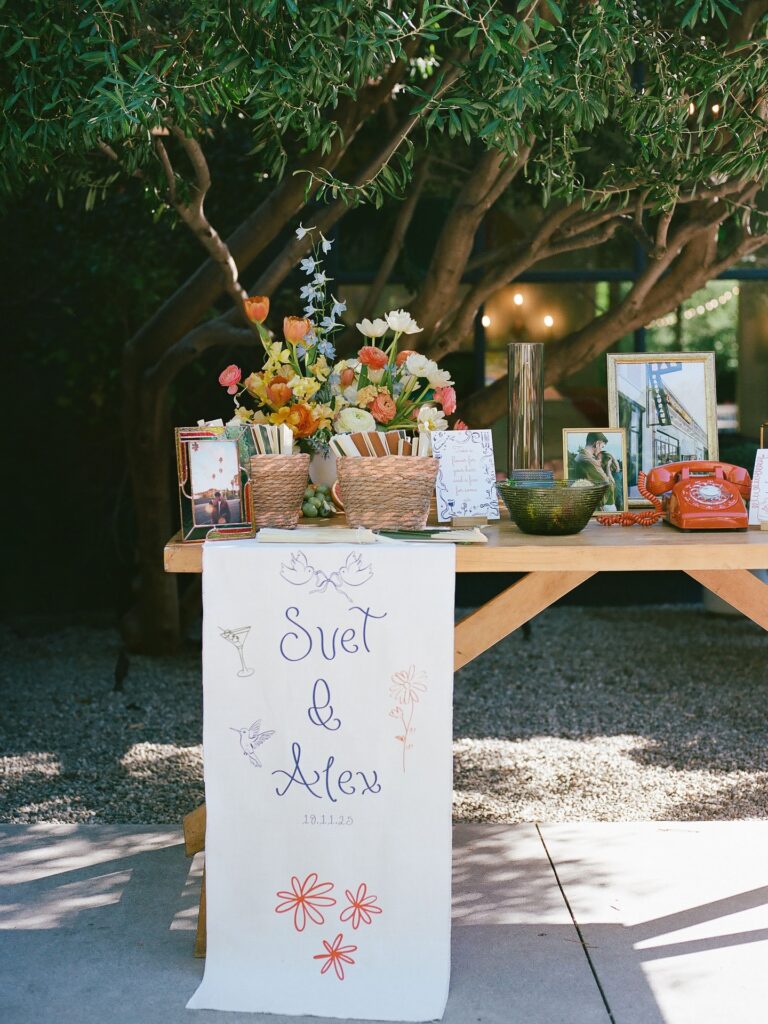
The runner doing the heavy lifting here is just a length of white fabric with the couple’s names, date, and a few doodles — martini glass, hummingbird, daisies, love birds. That’s it. You can do this with a cotton drop cloth from the hardware store and fabric markers in two or three colors. Sketch in pencil first. Keep the drawings loose and a little wobbly, because neat handwriting ruins the charm.
One thing I’d change: the runner puddles onto gravel and concrete in the photo, which means dirt. Hem it shorter, or fold the excess under the table.
Pair it with a welcome table like this one — baskets, framed photos, a bright vintage phone for voicemails from guests. The runner ties the mismatched objects together without matching any of them.
Pallet seating chart
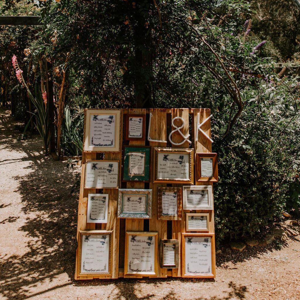
Start with a raw wood pallet and treat it like a grid, adding mixed thrifted frames in different sizes so the whole thing feels collected instead of rented. The big white initials at the top do most of the work here, because guests spot them fast from a distance and then move in close to read the cards.
Keep the palette loose. Gold, white, dark wood, even one painted frame like the green one all sit fine together as long as the paper design matches.
This suits an outdoor wedding. The pallet can stand on gravel without looking fussy, and the layered frames hold up better in a breezy garden than a single foam board on an easel.
I’d skip glass if it’s windy. Use backing boards, print directly on card, and tie or staple lighter frames so nothing shifts halfway through cocktail hour.
Stained Glass Welcome Sign
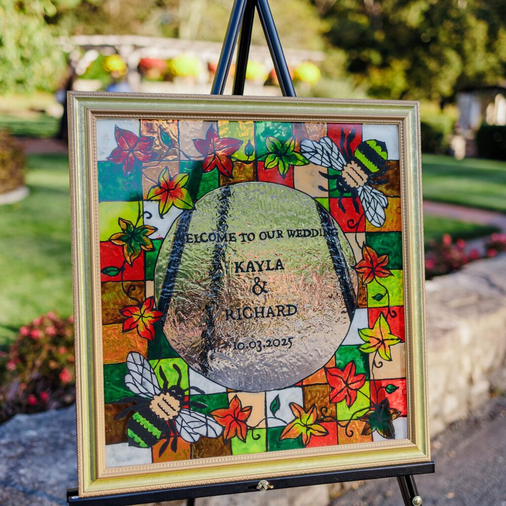
Craft stores sell glass paint and leading strips, which is basically all you need to fake the stained glass look on a plain picture frame with a glass insert. The patchwork of reds, oranges, and greens here works because it matches an October wedding — so pull your colors from the actual season you’re marrying in, not just what looks nice at the store. Painted bees are a personal touch, probably meaningful to Kayla and Richard specifically.
That kind of thing reads better than generic florals. The frosted oval center panel is where the couple’s names sit, and that contrast between the busy border and the clear center is what makes the text actually readable. A black easel keeps it upright without competing.
Fabric Heart Backdrop
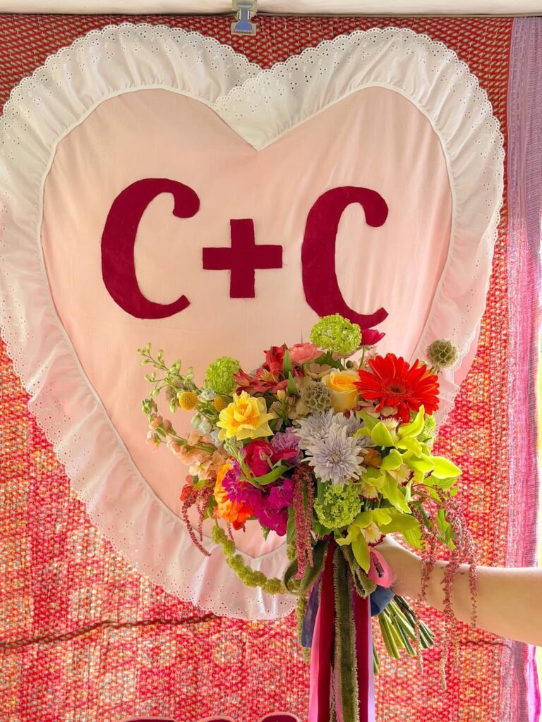
Hang a red patterned sheet first, then layer a large padded heart over it so the initials have a proper frame instead of floating on a plain wall. Use pale pink cotton for the heart, a strip of eyelet trim for the ruffle, and felt letters cut large enough to read from the back of the room. Keep it personal.
This works best behind a cake table, signing table, or small ceremony spot where guests will actually stop and look at it for a minute. If sewing the ruffle feels too much, gather it with fabric glue and hide the rough edge under piping. I’d skip tiny lettering here, because the whole charm is in those big red initials looking a little handmade.
Book Page Petal Cones
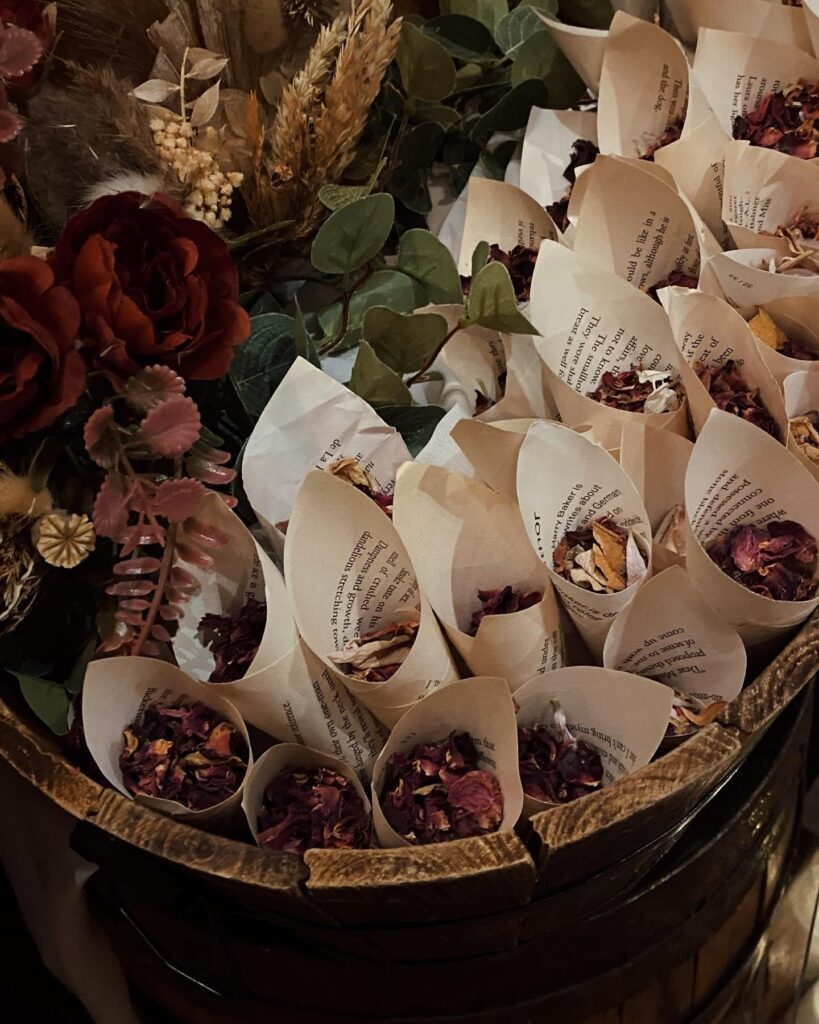
Tear pages from a battered paperback, roll them into cones, fill with dried rose petals. That’s it. The barrel in the picture holds maybe thirty of them, tucked in tight so they hold each other upright, with dried wheat and a few silk roses softening the edge.
Pick a book that means something — the couple’s favourite novel, a poetry collection, something inherited. Old pages yellow nicely and the print reads as texture from a distance. Skip glossy modern paperbacks, they curl wrong and the ink can smell.
A dab of glue at the seam stops them unravelling in someone’s hand. Dried petals over fresh, always, since fresh ones bruise within an hour and stain fingers. If you can’t find a wooden barrel, a shallow crate lined with linen does the same job.
Mailbox card station
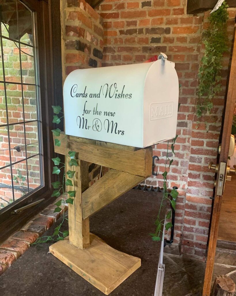
Set a white mailbox on a rough timber stand and you’ve got a card table that people understand straight away, which matters when guests are arriving, talking, carrying drinks, and not reading signs properly. The slot keeps envelopes contained, and the curved lid makes it feel more finished than an open basket.
Keep the lettering large and dark. Script looks nice here, but don’t go too thin or it disappears across the room.
That ivy strand helps. A little bit of trailing green softens the box and ties it back to the rest of the decor without much work.
Use weight in the base. Cards add up, and a top-heavy stand is more risk than it looks. I’d also make sure there’s an easy way to open the mailbox after, because some decorative ones are annoying once all the envelopes are inside.
Place Card Favors Tied Together
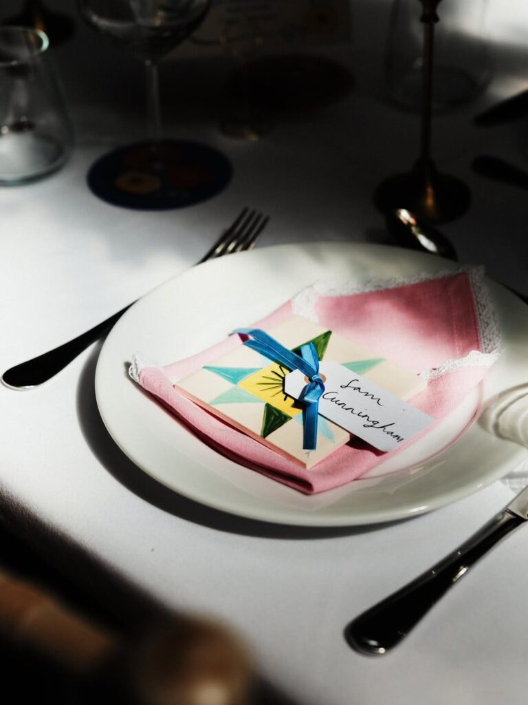
Folding the napkin flat on the plate first, then laying a small wrapped favor on top, is what makes this work — the napkin becomes a kind of tray. The blue ribbon here does double duty, holding both the favor and the name tag in one knot. That’s worth copying.
For the tag, handwritten script reads better at a table than printed labels, which can look like they came off a mailing envelope. The favor itself looks like a painted matchbox or small tile — anything similarly flat and light will sit without sliding. If your color palette is different, the ribbon is the easiest thing to swap out.
I’d skip the bow if you’re doing more than 30 place settings. A simple knot takes half the time.
Striped welcome banner
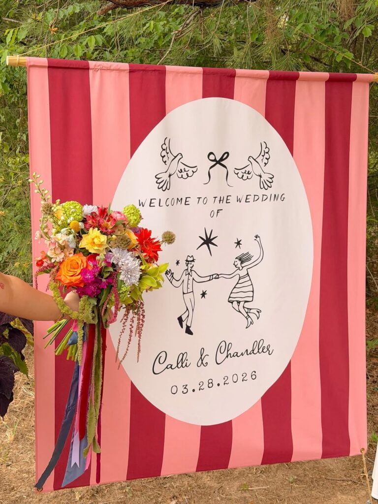
Hang the striped cloth from a plain dowel first, because the top sleeve is what keeps the whole sign from sagging once guests start taking photos. The big white oval can be iron-on vinyl, painted canvas, or even a printed panel stitched on top. Keep the drawing simple.
Two birds, a bow, the couple’s names, and the date are enough, especially when the fabric already carries so much color. Use a shower curtain or tablecloth if sewing long strips sounds like more work than you want. The bouquet in front shows why this suits a garden wedding: it gives flowers a loud background without needing an arch.
I’d use heavier fabric so the bottom corners stay flat in the wind.
Hand-Painted Monogram Plates
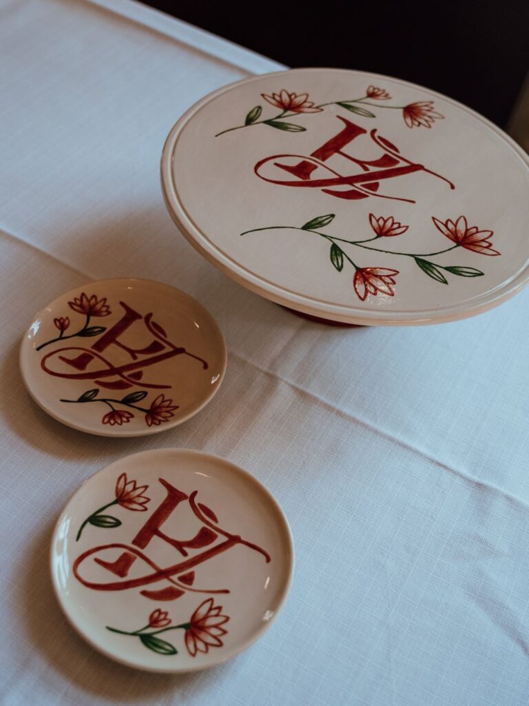
These are the kind of thing you commission once and use forever. The set here pairs a monogrammed cake stand with smaller matching plates, all done in that rust-red script with little flowers trailing around the letter. If you can paint, ceramic paint pens on plain white bisque plates from a pottery studio will get you close.
If you can’t, find a local ceramicist on Instagram and send them your initials plus a reference. Use the big one for the cake, the small ones as favor plates at each seat, or under a single truffle. One thing I’d skip: trying to do a full set of matching dinner plates.
Too much work, and the monogram loses its impact when it’s on everything.
Blue candles and bud vases
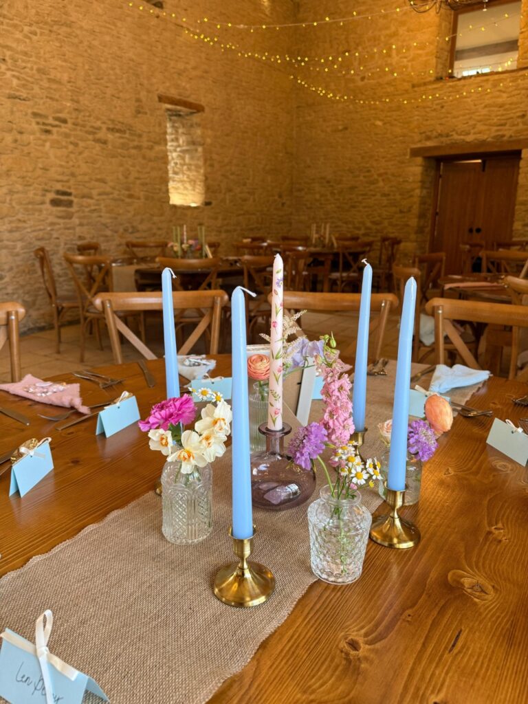
Start with the runner. A strip of hessian or any loose-weave neutral fabric down the middle of the table gives all the small pieces somewhere to sit, so the candles, glass bud vases and place cards look grouped instead of scattered.
Then build around four taper candles in brass holders, using one odd candle in the middle if you want it to feel less stiff. The pale blue works because it breaks up all the wood tones without fighting the flowers, and the mix of tiny vases keeps the arrangement low enough for people to talk across the table for hours without moving anything.
Use whatever flowers are cheap that week. Garden stems are fine.
I’d skip anything too uniform here, because this idea looks better when the vase shapes don’t quite match and the bunches are a bit uneven.
Seating Chart on String
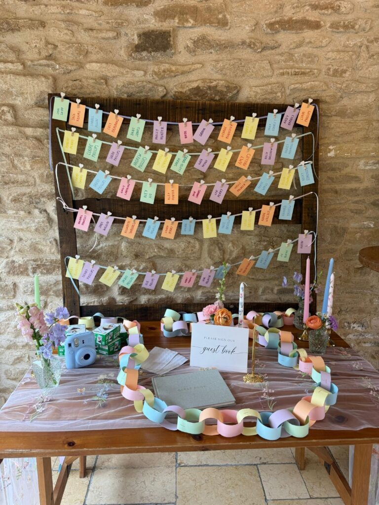
The small heart-shaped pegs holding each name card are doing a lot of work here — swap those out for plain wooden clips and the whole thing reads differently, more craft fair than wedding. Get the cards printed in four or five pastel shades, then hang four or five lines of thin ribbon or twine across a dark wooden board. Stone walls behind it, like this one, help the colours show up.
The paper chain looped around the guest book on the table below is made from the same palette, which is what pulls the table and the board together as one display rather than two separate things. Honestly the Instax camera on the table is a nice addition — guests can take a photo and leave it tucked in the guest book.
Hand Drawn Timeline Sign
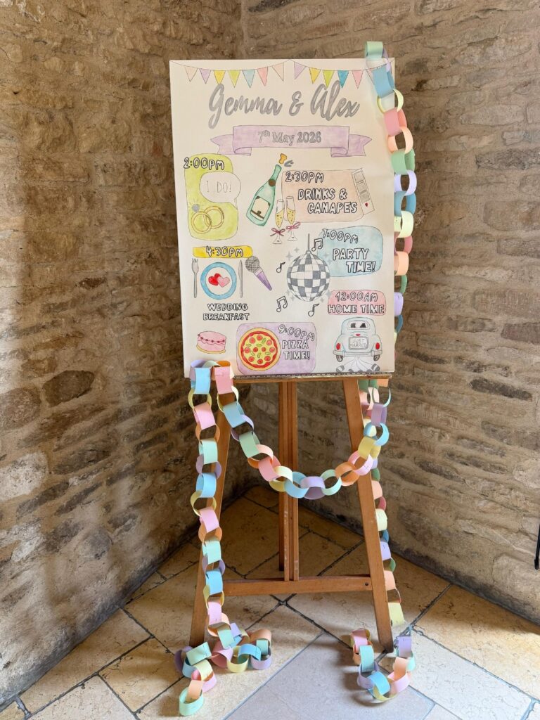
If your day has a few clear moments, a hand drawn timeline on an easel is worth doing. Keep the layout loose, with big times first, then small sketches like rings, pizza, drinks, or the car home around them. It gives guests something to read while they wait.
Use thick white card, pencil the whole thing first, then go over it with marker and soft colouring pencils so mistakes don’t become a full disaster. The paper chain down the side is the bit that makes it feel homemade in a good way. I’d skip very tiny lettering unless someone in the wedding party has neat handwriting, because people will be reading this from a few steps back.
Custom Temporary Tattoos For Guests
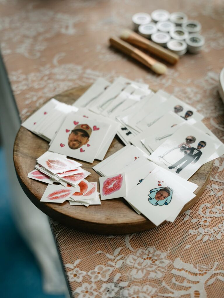
These are the little cartoon versions of the couple, plus lipstick kiss prints and cropped face shots with tiny hearts around them. You order them from any custom temporary tattoo site — send in a headshot or a cartoon your illustrator friend draws, and they print sheets you cut down into singles. Set them out on a wood board near the bar with a bowl of water and a stack of small cloths.
Guests apply them mid-reception. Kids love them most. The lipstick kisses feel a bit random to me if they aren’t actually your kiss print, so I’d skip those and stick to the faces and the cartoon portraits.
Works best for couples who don’t mind their faces on someone’s forearm in every dance floor photo.
Painted arch backdrop
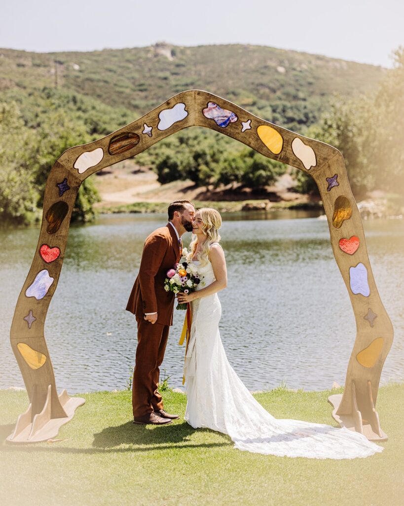
Start with plywood. This works best when the arch itself does most of the decorating, so you do not need to pile on florals that fight with the lake view behind it. Cut one wide arch, then carve out irregular inlay shapes and back them with painted hardboard, acrylic, or resin pieces in cloud, heart, star, and oval forms.
Keep the palette loose. A few cream and amber pieces, one red heart, one purple star, maybe a marbled blue insert near the top, and the whole thing feels handmade without looking like a kids’ craft table.
Weight matters here. Add broad feet at the base like the one shown, then sand every edge well because guests will brush past it.
Best for outdoor weddings. I would skip very tiny inserts unless you have a jigsaw and patience, because they take more time than they give back visually.
Vintage Suitcase Card and Gift Station
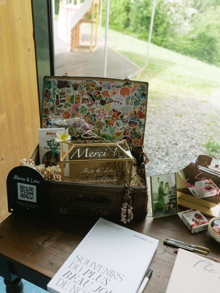
An old travel suitcase does a lot of work here — lid open, interior covered in tropical stickers, holding a engraved glass card box, shells, a small framed wedding photo, a Tahiti guidebook. The whole thing reads as a story about the couple rather than just a place to drop envelopes. Source a beat-up suitcase from a thrift store or estate sale, the more worn the leather the better.
Line the inside of the lid with stickers that mean something — travel destinations, shared interests, anything that fills the space with personality. The glass box with “Merci” engraved on it is the functional centerpiece; a local trophy shop or Etsy seller can do that for under $40. Nest it in raffia or dried moss so it sits steady.
Keep a QR code sign nearby like the one on the left — guests appreciate an easy way to share photos.
Golf Cart Sendoff Sign
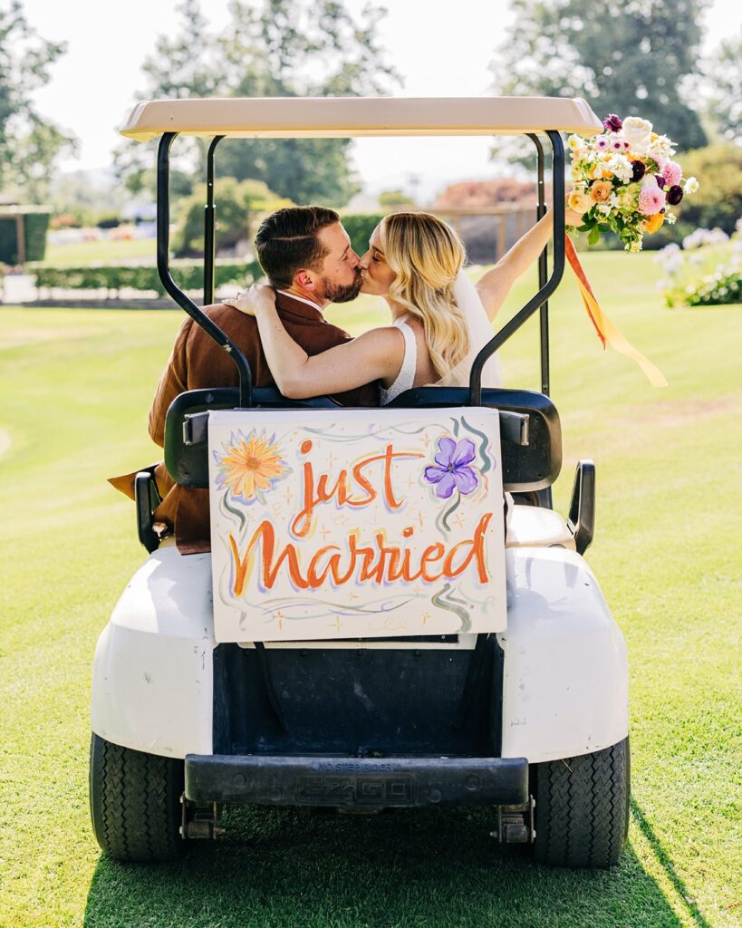
That back rail is the useful part here, because you can hang a painted “just married” board without touching the cart body. Use zip ties. Cover them with ribbon so nobody sees the hardware in photos.
A small bouquet on one side, tied near the roof support, gives the cart enough decoration without blocking the couple or the driver’s view. I’d skip heavy wood for this and use foam board or thin plywood, especially if the cart has to cross grass. Paint the lettering large, like the orange script here, because tiny words disappear once the cart starts moving.
Leave the rest loose.
Pressed Flower Seating Chart
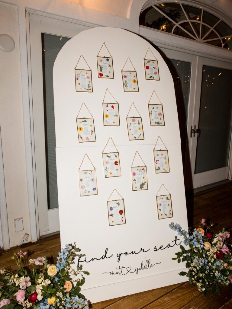
Each table gets its own small brass-framed card with pressed flowers scattered around the guest names. The arched white board holds them on little chains, and the whole thing sits between two floor arrangements at the entrance.
Making these takes time. You’ll need to press flowers about two weeks ahead, so factor that in or buy pre-pressed ones from Etsy. The brass hanging frames are the easy part — they’re everywhere online for a few dollars each.
One card per table means guests actually stop and look, which slows down the arrival crush at the door. Worth knowing.
If I were doing this, I’d skip the second floor arrangement and put that flower budget toward better frames. The chains catch light and do more work than a second bouquet ever would.
Tissue fringe garland
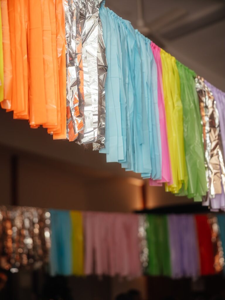
Start with tissue tassel garlands in 3 or 4 colors, then break them up with strips of silver foil fringe so the whole thing doesn’t turn into one long block of pastel. It works well above a dance floor, dessert table, or photo corner because the pieces move a little and catch light without needing much else around them. Very easy.
Keep the tassels packed fairly tight on the string, but not crushed, or they start looking like flattened party-store leftovers instead of wedding decor. If your palette is softer, swap the neon orange and lime for blush, cream, or dusty blue and keep one metallic row in between to hold some contrast. I’d skip hanging these too low over dining tables, mostly because tissue fringe can look messy fast once people keep brushing against it.
Hanging Name Card Display
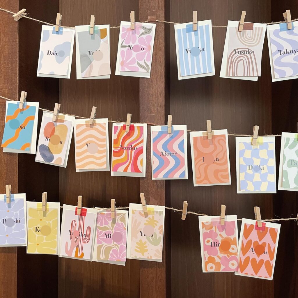
Three twine lines pinned across a dark wood panel, each card clipped with a small wooden peg — this one scales up or down depending on your guest count without looking sparse either way. Print each card with a different pattern so no two are the same; the image shows wavy lines, checkerboard, florals, abstract blobs, all sitting next to each other without clashing because the palette stays soft. Pastel with one or two louder cards mixed in.
You’d source these through any print-on-demand site, drop the guest names in during layout, and the twine goes up with two nails or adhesive hooks. Guests pull their card off as they find their seat, which means the display naturally clears itself. Skip laminating — it makes them feel like luggage tags.
